Every Al Brooks trader knows the feeling. The market has drifted sideways for the eighth bar in a row, the candles are overlapping each other like roof tiles, the EMA is flattening out — and without anyone telling you, you know: this is a trading range. Maybe barbwire. Either way, not the place to be entering trades.
But what makes you know that? And can you write that knowing as code that works on any market?
This is the next one in the series. After the buy signal bar, the natural step up is the bigger picture: market state. Trading ranges, channels, spikes, barbwire — all the things a single bar can’t tell you, but a window of twenty can. Same approach as before: write the rules down strictly, run them on real data, see what actually holds up. No cherry-picked charts.
Why this is harder than it sounds
If you’ve spent any time reading Al Brooks (or watched even one of his charts), you know the man sees structure in places where the rest of us see noise. Trading ranges, bull channels, spikes, pullbacks, barbwire, micro double tops — every bar has a name and a story.
The annoying part: most of those concepts are defined in plain English. “A trading range is a sideways area where price is largely contained between two levels.” Cool. Now write that in code. How sideways is sideways? How long does it have to last? What counts as “largely contained”?
I started with hard-coded numbers. A trading range is “any 10 bars where the high-low spread is less than 50 points.” That worked great. On the Nasdaq. For about a week. Then I pointed it at the Dow and got nothing — because the Dow at 40,000 moves 200 points before breakfast and “50 points” is meaningless. Then I tried the DAX. Same problem in the other direction.
The fix turned out to be obvious in hindsight: stop measuring in points, start measuring in ATR units.
ATR is the great equalizer
Average True Range is the volatility yardstick that scales with whatever you’re looking at. If a market’s typical daily move is X, then “a tight range” is some fraction of X and “a wide range” is some multiple. The instrument changes; the relationship stays the same.
So every bar in my pipeline gets ATR-14 attached to it, alongside the usual stuff:
def add_indicators(df):
    df = df.copy()
    df["EMA20"] = df["Close"].ewm(span=20, adjust=False).mean()

    h, l, c = df["High"], df["Low"], df["Close"]
    tr = pd.concat([
        (h - l),
        (h - c.shift(1)).abs(),
        (l - c.shift(1)).abs()
    ], axis=1).max(axis=1)

    df["ATR"]       = tr.rolling(14).mean()
    df["Bar_Range"] = h - l
    return df.dropna()
Nothing fancy. EMA-20 for trend context, ATR-14 for volatility, bar range so I don’t have to compute it ten times later. With that in place, the same logic now works on the Nasdaq, the Dow, and the DAX without changing a single threshold.
Step one: name every bar
Before you can describe a chart, you need to describe a bar. Brooks has a vocabulary for this — strong trend bars, reversal bars, doji, trend bars — and it’s all based on the relationship between the body and the tails.
A bar is a “strong bull bar” if its body is at least 60% of its range and it closes up. A “bull reversal bar” has a long lower tail (at least half the bar’s height) and closes up. A “doji” is when the body is too small to mean much. Translating that:
def classify_bar(row):
    o, h, l, c = row["Open"], row["High"], row["Low"], row["Close"]
    rng = h - l
    body       = abs(c - o)
    upper_tail = h - max(c, o)
    lower_tail = min(c, o) - l

    if body >= 0.60 * rng:
        return "Strong Bull Bar" if c > o else "Strong Bear Bar"
    if lower_tail >= 0.50 * rng and c > o:
        return "Bull Reversal Bar"
    if upper_tail >= 0.50 * rng and c < o:
        return "Bear Reversal Bar"
    ...
The thresholds (60%, 50%, 40%) are choices, not laws. I tried tighter and looser settings; these felt the closest to what Brooks calls “decisive” bars on a 5-minute chart. Could probably tune them per timeframe. Haven’t bothered yet.
Step two: describe the neighborhood
A single bar tells you almost nothing. A run of bars tells you everything. So the next layer asks: looking at the last 20 bars or so, what’s actually happening?
I use a small set of states and the order they’re checked in matters more than I expected:
- Barbwire first. This is the chop zone — three or more bars that overlap each other heavily, often with prominent tails. Brooks’s advice is famous: beginners should stop trading. If the algorithm sees barbwire, nothing else matters. No signal, no setup, walk away.
- Spike next. Three consecutive strong-bodied bars in the same direction with very little overlap. This is momentum that just broke something. Often the start of a channel.
- Channel after that. If price has been closing above the EMA for at least 9 of the last 12 bars, that’s a bull channel. Below, bear channel. The 9-of-12 rule comes from Brooks’s idea that the EMA acts as a sort of magnet in trending phases.
- Trading range as the default. If nothing else fits, the market is doing nothing in particular, and “nothing in particular” is sideways.
The barbwire check looks roughly like this:
def _is_barbwire(window, n=3):
    bars = window.tail(n)
    for i in range(len(bars) - 1):
        a, b = bars.iloc[i], bars.iloc[i + 1]
        rng = a["High"] - a["Low"]
        overlap = min(a["High"], b["High"]) - max(a["Low"], b["Low"])
        if overlap / rng < 0.40:
            return False
    return True
If every consecutive pair in the window overlaps by 40% or more, that’s barbwire. It’s a deceptively simple rule that catches a lot of the messy nonsense that ruins trend-following systems.
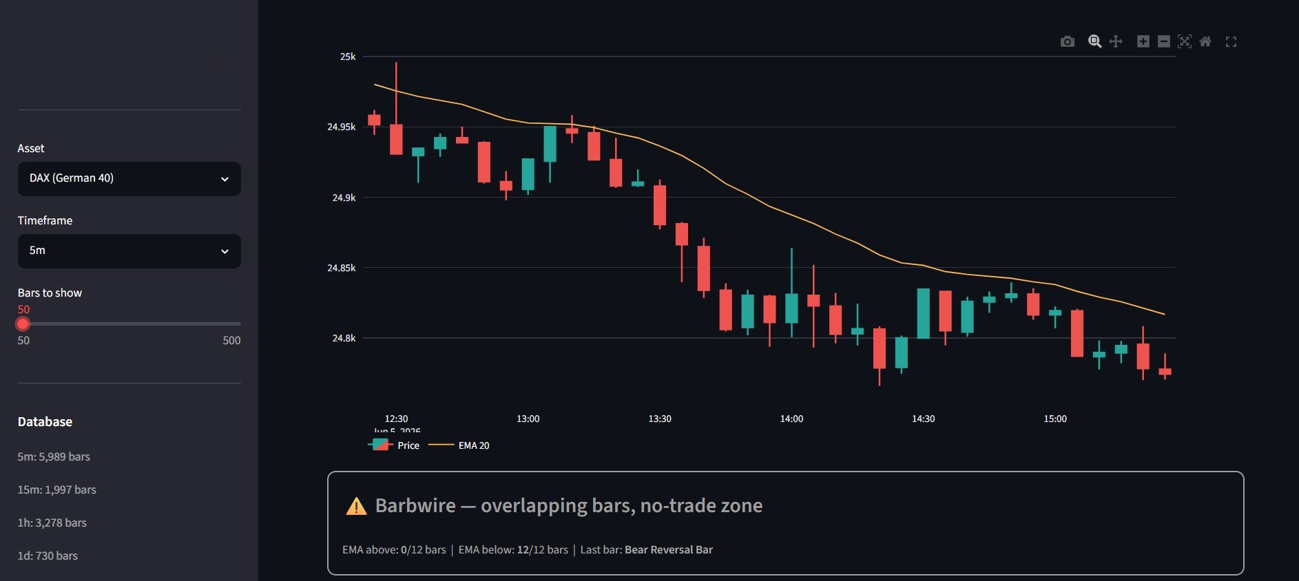 The dashboard catching live barbwire on the DAX 5-minute. Notice the EMA reading: 0 of the last 12 bars above, 12 below — strongly bearish bias, but the overlapping bars in the recent action override everything else with a “no-trade zone” call.
Step three: find the actual trading ranges
The market-state detector tells you what the current situation is. But for any of this to be useful, you also want to find every distinct trading range in the recent history — and then watch what happens when one of them breaks.
This is where I spent the most time, and where most of my early attempts fell apart. I tried pivot-based clustering. I tried Bollinger Band width compressions. I tried fractal-based swing detection. They all worked sometimes and broke other times, usually in ways I couldn’t explain.
What finally clicked was forward-greedy expansion. Walk through the bars one at a time. Open a window at bar i. Keep adding the next bar to the window as long as the total high-low spread stays under some multiple of ATR. The moment a bar breaks that constraint, close the window. If it lasted at least 5 bars, it’s a trading range. Move on.
while i < n - 2:
    seg_h = float(df["High"].iloc[i])
    seg_l = float(df["Low"].iloc[i])
    j = i

    while j + 1 < n:
        next_h = max(seg_h, float(df["High"].iloc[j + 1]))
        next_l = min(seg_l, float(df["Low"].iloc[j + 1]))
        atr_j  = float(df["ATR"].iloc[j + 1])

        if (next_h - next_l) > atr_j * atr_mult:
            break  # this bar broke the range

        seg_h, seg_l = next_h, next_l
        j += 1

    if (j - i + 1) >= min_tr_bars:
        trs.append({"start_i": i, "end_i": j,
                    "high": seg_h, "low": seg_l, ...})
        i = j + 1
    else:
        i += 1
There’s something pleasing about how dumb this is. No regression lines, no machine learning, no clever statistics. Just: how far can I go before the box gets too tall? If far enough, record it. If not, shrug and shuffle forward.
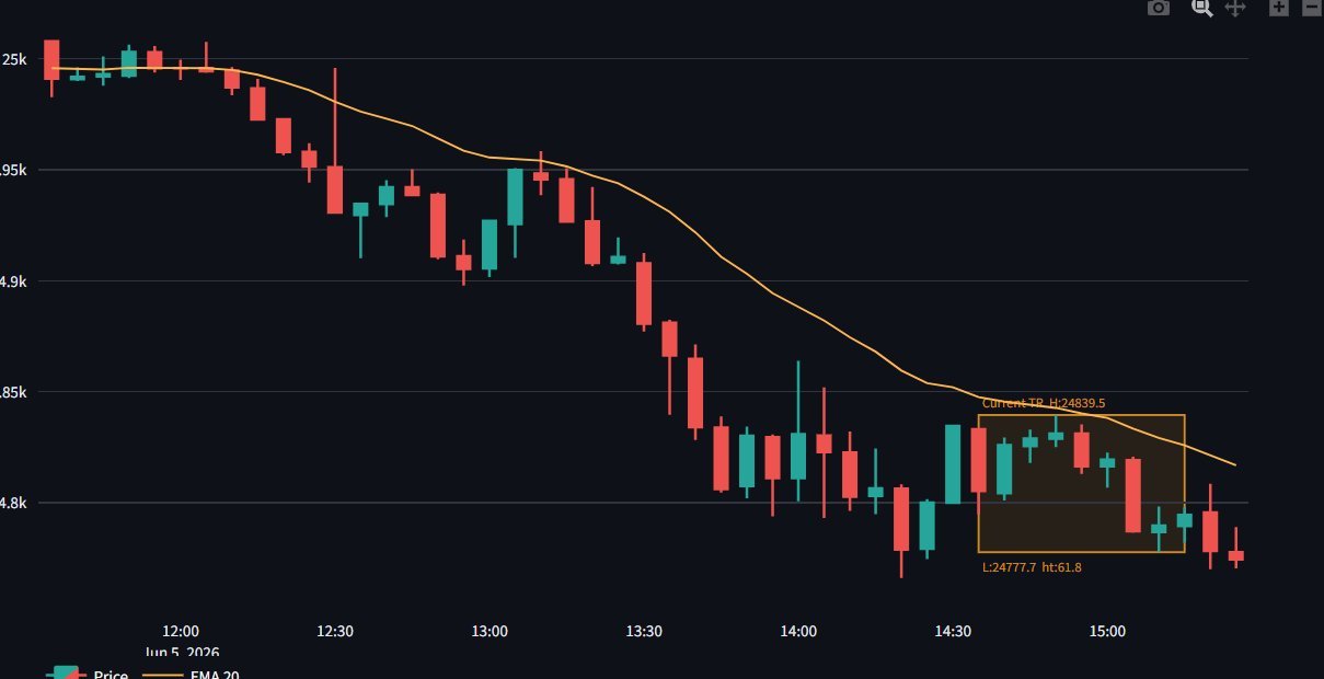 Here’s what it looks like in practice — after a clean bear leg from 25k down to 24.8k, the algorithm spotted the consolidation in the bottom-right corner and boxed it. High 24,839.5, low 24,777.7, height 61.8 points. If price breaks below the low, the measured-move target is around 24,716.
Two parameters control everything — the ATR multiplier (I use 2.0) and the minimum bar count (I use 5). Lower the multiplier and you’ll find lots of tiny tight ranges. Raise it and you’ll only catch the obvious ones. Five bars is roughly Brooks’s threshold for “this counts.”
Step four: the breakout and the measured move
A trading range is only interesting because of what happens when it ends. And the most useful thing in technical analysis — possibly the only thing I actually trust — is the measured move.
The logic is older than computers. A range that’s H tall, broken to the upside, tends to project a move of roughly H past the breakout point. Same in reverse on the downside. That’s it. Range height = first target. It’s not magic and it doesn’t always work, but it works often enough that practically every breakout trader on earth uses it.
So after a TR is closed, the code scans the bars after it. The first close outside the box is the breakout. Direction is whichever side it broke. Target is the box height projected past the breakout.
if close < prev["low"]:
    target = round(prev["low"] - prev["height"], 2)
    breakouts.append({"direction": "DOWN", ...})
    measured_moves.append({"target": target, ...})
elif close > prev["high"]:
    target = round(prev["high"] + prev["height"], 2)
    breakouts.append({"direction": "UP", ...})
    measured_moves.append({"target": target, ...})
When you plot these on a chart with horizontal lines at the targets, the alignment is sometimes uncanny. The market hits the projection, pauses, sometimes reverses, sometimes continues — but it almost always acknowledges the level in some way. That alone has changed how I look at charts.
What works now, and what’s next
Let me be clear about where the code actually stands, because the screenshots above aren’t mockups — that’s the live output.
It runs end-to-end. The Flask backend pulls bars, market_structure.py analyzes them, and a Streamlit dashboard surfaces the current state across the Nasdaq, Dow, and DAX in parallel — same thresholds for all three markets, no per-instrument tuning. Trading ranges get detected and boxed automatically. Barbwire phases get flagged as no-trade zones in real time. Breakouts get caught and measured-move targets get projected. That’s the part I’m genuinely proud of, because getting one set of rules to behave consistently across instruments at different price scales took the most iteration.
That said, here’s what I want to add next:
The channel detection is too binary. Brooks talks about tight channels, broad channels, micro channels, spike-and-channel patterns — my code basically just says “channel” and stops there. Lots of nuance left to encode.
Spike detection requires three confirmed bars, which means it labels late. By the time the algorithm is sure it’s a spike, the first leg of the move is already done. Brooks reads spikes from the first bar. I haven’t figured out how to teach that to a computer yet, but it’s the obvious next problem.
Failed breakouts aren’t detected as their own setup yet. Per Brooks, most breakouts in trading ranges fail — they reverse back inside the box and trap the late entrants. That’s a tradable pattern in its own right, and adding it would round out the toolkit.
And there’s no higher-timeframe context. A “bull channel” on the 5-minute might actually be a pullback inside a daily bear trend. Right now each timeframe is analyzed in isolation. Stitching them together is on the roadmap.
Why this was worth doing
Even with those gaps, the exercise of forcing yourself to write down what you mean by “trading range” or “breakout” or “spike” makes you a sharper chart reader. You can’t hide behind vibes when the function has to return a string.
Every time the dashboard labels something in a way that doesn’t match my gut, I learn what my own intuition is using that the algorithm isn’t — and then I either teach the algorithm or accept that some part of trading really is just pattern recognition wired into a brain that’s seen thousands of charts.
Most of the time the tool tells me “Trading Range” or “Barbwire” — which, if you’ve read any Brooks, is probably the most honest read of the markets anyway. Trends are the exception. Sideways is the norm. A tool that can confidently flag the sideways chop and tell you to step back is, frankly, doing 80% of the job.
If you’ve gone down a similar rabbit hole, I’d love to know which Brooks concepts you’ve managed to actually codify and which ones still feel impossible. My guess: we’re all stuck on the same five.